I share in-depth, battle-tested tips on UI/UX, Copywriting & Marketing that actually work.
Share
How to Build a Truly Mobile First Website
Published over 1 year ago • 4 min read
Digital Minute
Jan 23rd
How to Build a Truly Mobile-First Website
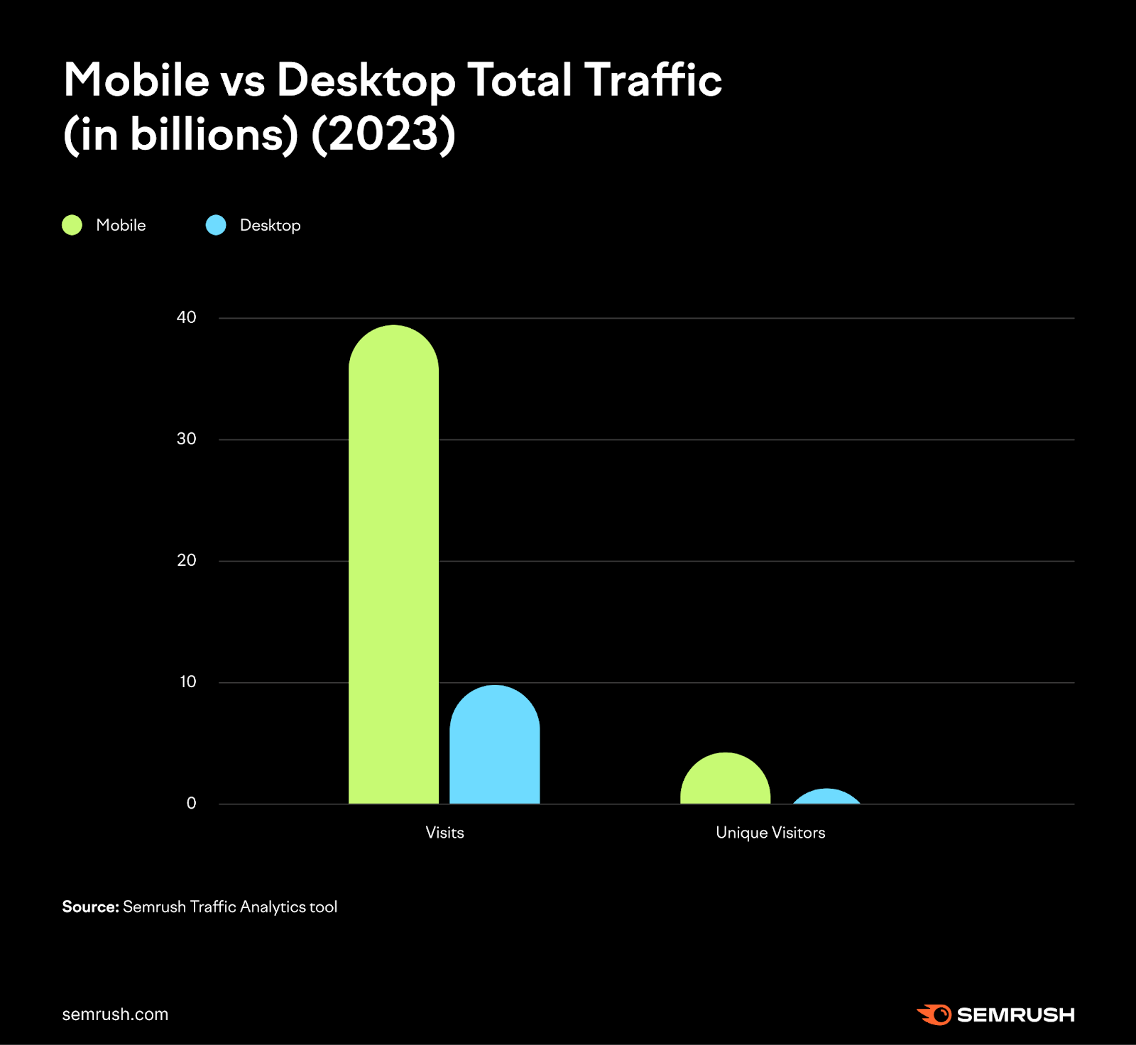
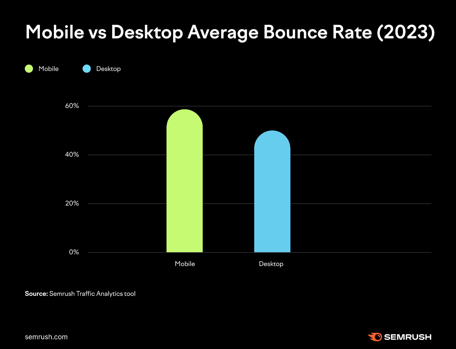
Semrush conducted an analysis based on the top 100 most visited websites in the U.S. using Semrush’s Traffic Analytics tool. Here are the two key findings:
Mobile devices receive more website visits and unique website visitors than desktop
Mobile usage had a higher bounce rate than desktop
The data aligns with the widespread use of mobile devices and the increasing optimization of websites for mobile browsing.
Mobile devices are often the go-to choice for accessing information, services, and entertainment instantly, as well as for quick searches and answering questions.
On the other hand, desktops, with their larger screens, are better suited for visual work, detailed analysis, and multitasking. Their multi-monitor setups and ability to handle multiple tabs simultaneously create a more seamless and in-depth product research experience.
Regardless, let's not jump to conclusions about a mobile preference without further context or user feedback.
Always review your data (e.g. Google Analytics) for more detailed insights.
We Will be Looking at Two Things:
Mobile-first design
Mobile-first indexing
Mobile-First Design
“Mobile First means designing for mobile before designing for desktop or any other device (This will make the page display faster on smaller devices).
This means that we must make some changes in our CSS.
Instead of changing styles when the width gets smaller than 768px, we should change the design when the width gets larger than 768px. This will make our design Mobile First.”
— w3schools
Key Idea of Mobile First
Start Small, Then Scale Up: Instead of designing for desktop first and then scaling down for mobile, you design for mobile first and then add enhancements for larger screens.
Progressive Enhancement: Begin with a basic, functional design for mobile devices, and then progressively add more features or layout adjustments as the screen size increases.
Why Mobile First?
Performance: Mobile-first designs tend to be lighter and faster because they prioritize simplicity and efficiency, which is crucial for mobile devices with limited resources.
User Experience: With the majority of web traffic coming from mobile devices, designing for mobile first ensures that the most common users have the best experience.
Future-Proofing: As new devices with varying screen sizes emerge, a mobile-first approach makes it easier to adapt the design to different contexts.
In Traditional (Desktop-First) Design
You might write CSS for desktop and then use max-width media queries to adjust the layout for smaller screens. For example:
In a Mobile-First Approach
You start with the mobile layout and use min-width media queries to add styles for larger screens. For example:
"Mobile usability is not the same as mobile-first indexing.”
"And one of the things that we noticed that people are still often confused about is with regards to, like if I only have something on desktop, surely Google will still see that and it will also take into account the mobile content.
But actually, it is the case that we will only index the mobile content in the future.
So when a site is shifted over to mobile first indexing, we will drop everything that’s only on the desktop site. We will essentially ignore that.
…anything that you want to have indexed, it needs to be on the mobile site."
— John Mueller
Mobile-First Indexing Best Practices
1) Create a Mobile-Friendly Website
If you haven't already, create a mobile-friendly website so your users visiting your site through a mobile phone can have a stellar experience. There are three configurations you can choose from to create a mobile-friendly site:
Responsive Design (Recommended): Use the same HTML and URL for all devices, but adjust the layout based on screen size.
Dynamic Serving: Serve different HTML based on the user-agent while keeping the same URL.
Separate URLs (m-dot): Use different URLs for mobile and desktop (e.g., m.example.com).
2) Ensure Google Can Access and Render Your Content
Use the same robots meta tags on both mobile and desktop versions. Avoid noindex or nofollow on mobile.
Avoid lazy-loading primary content that requires user interaction (e.g., clicking or swiping). Google won’t index such content.
Allow Google to crawl all resources (e.g., images, CSS, JavaScript) by avoiding disallow rules in robots.txt.
3) Maintain Consistent Content Across Desktop and Mobile
Ensure the primary content is the same on both versions.
Use the same headings, metadata, and structured data on both versions.
If space is limited on mobile, consider using accordions or tabs instead of removing content.
4) Optimize Structured Data
Use the same structured data (e.g., Breadcrumb, Product, VideoObject) on both versions.
Ensure URLs in structured data are updated for mobile versions.
Use Rich Result Testing Tool or Schema Markup Validator to audit your website structured data
The Ecom Edge Feb 4th How to Make Your Marketing Campaign More Effective When it comes to marketing, it’s easy to get lost in the details. Between tweaking ad platforms, testing landing pages, and analyzing data, it’s tempting to think that the secret to success lies in perfecting the technical setup. But here’s the truth: no matter how well-optimized your campaign is, if your message doesn’t connect with your audience, it won’t work. In this article, you’ll find: Why Your Message Matters...